
4.2 KiB
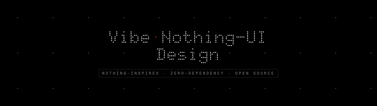



A Nothing-inspired UI component library for the web.
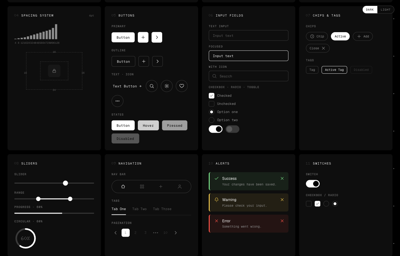
Not a spec or a ruleset — actual, ready-to-use components you copy in and ship: buttons, inputs, tables, navigation, cards, dialogs, an applied app screen, and more. Monochrome surfaces · round-dot type & icons · a single signal-red accent · a sparse dot field that inverts against whatever sits behind it. Zero dependencies — pure HTML, CSS custom properties, and a little vanilla JavaScript. No framework, no build step.
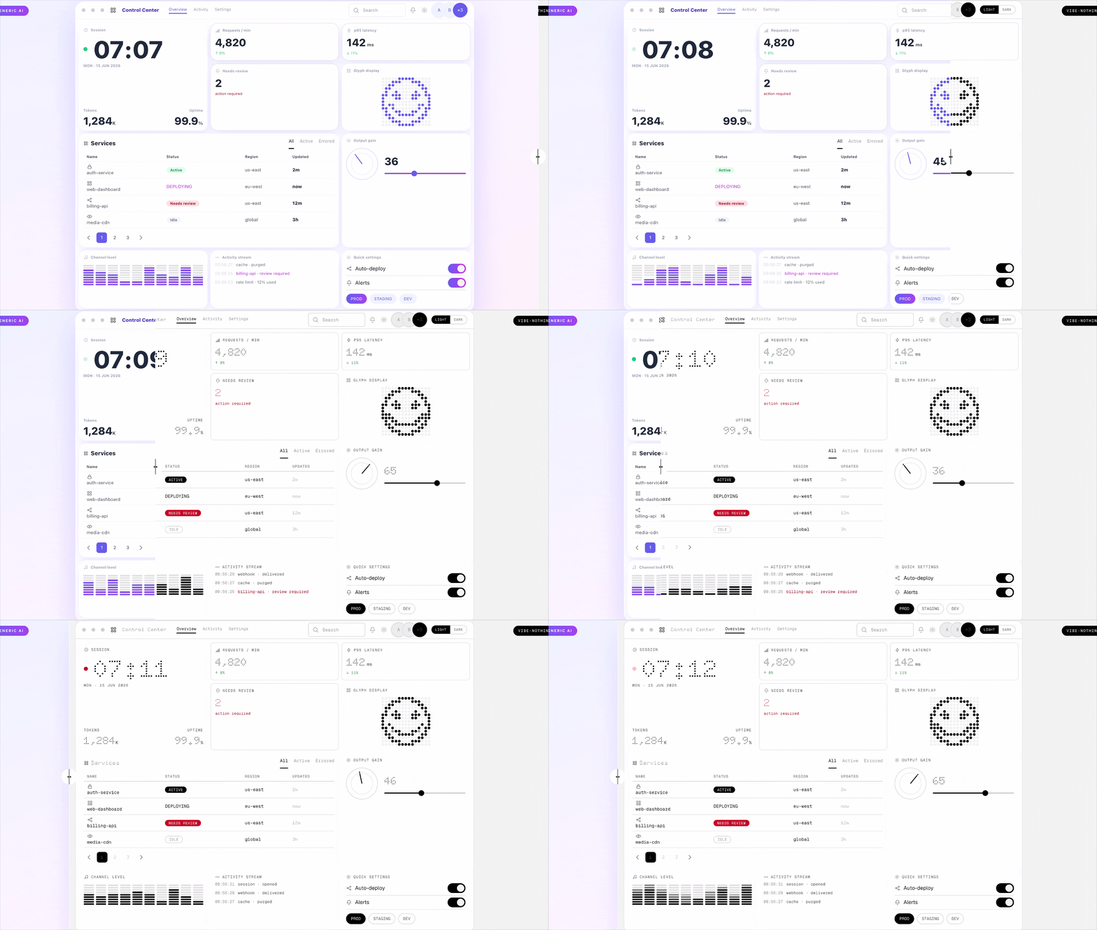
Generic AI output ⟷ Vibe-Nothing-UI
Drag the divider — same content, default AI styling on the left, this system on the right.
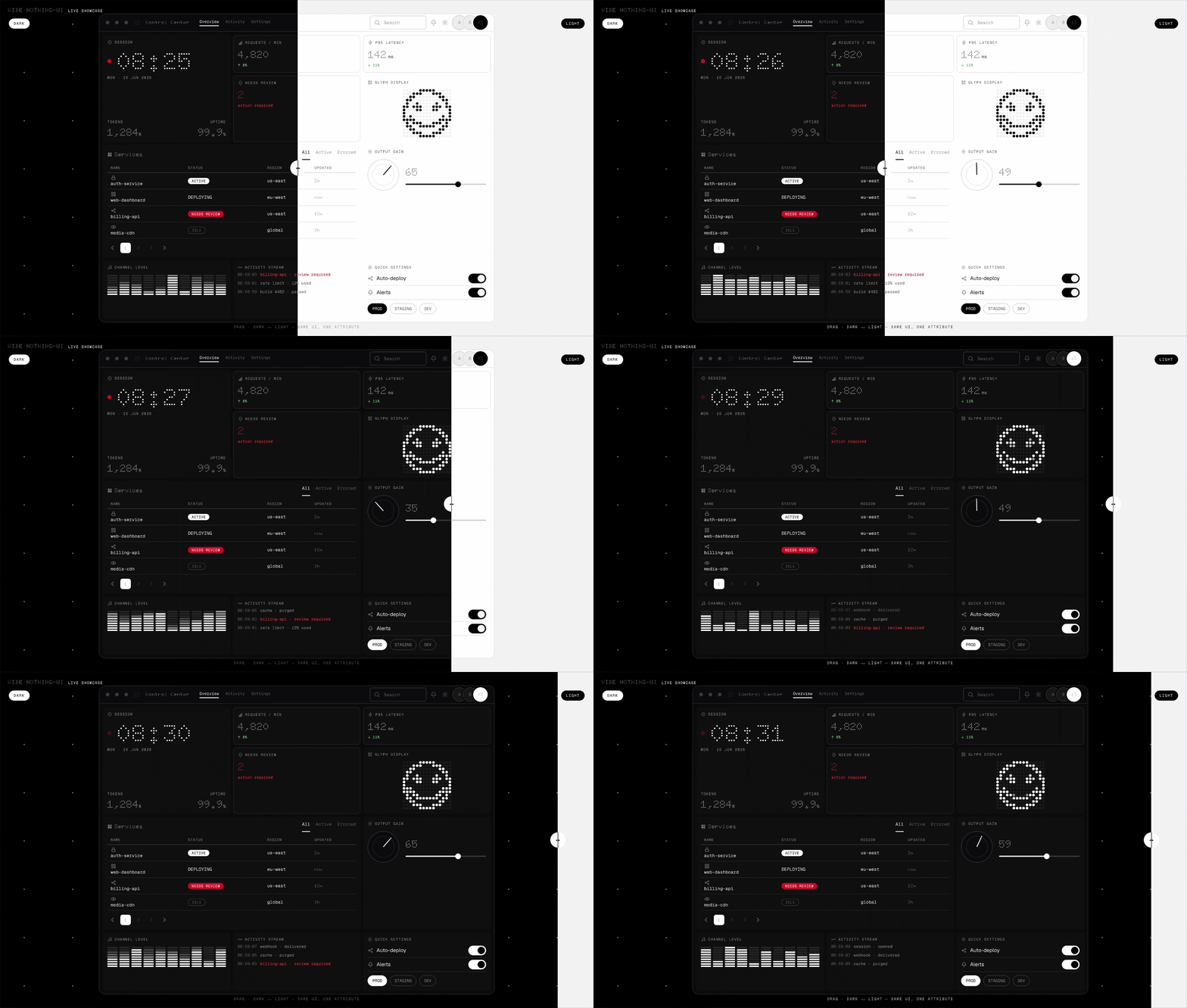
Dark ⟷ Light — one attribute
Quick start
<link rel="stylesheet" href="css/nothing-ui.css">

<body data-theme="dark">
  <button class="btn btn-primary">Run agent</button>
</body>

<script src="js/nothing-ui.js"></script>
Keep the bundled fonts/open/ folder next to the CSS, and switch theme on any ancestor:
<main data-theme="light">…</main>
No package manager, no compiler — copy the files into any static site, or take the tokens into your own stack.
Components
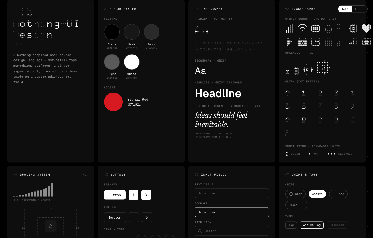
Foundations, forms, navigation, feedback, data display, dynamic controls, and an applied app screen — 46 components, all in two themes.
An applied screen
A complete application view assembled only from the library — sidebar navigation, breadcrumb, search, a data table with status pills, and pagination. The accent red shows up only on genuine signals (deploying, needs review). See it live →
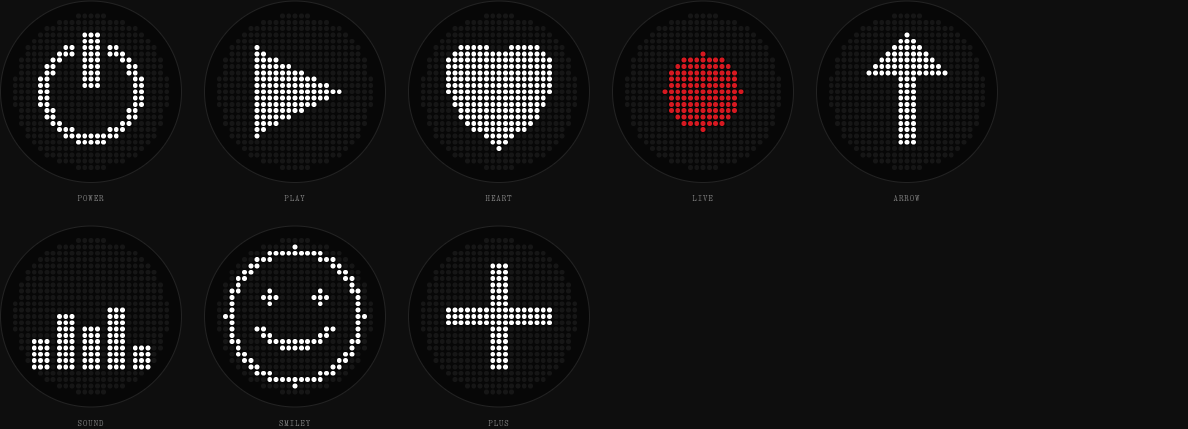
Glyph Matrix
A canonical 25×25 circular-masked dot panel (the Phone (3) grid), plus scalable 9×9 interface icons.
Principles
- Black, grey, and white carry the hierarchy; the accent is reserved for live / blocked / needs-input signals.
- Controls use black↔white inversion, never the accent color.
- Depth comes from hairlines, whitespace, and frosted glass — no shadows, no gradients.
- One round-dot geometry runs through type, icons, and status glyphs.
- Functional UI stays sans-serif; an editorial italic appears only in page-level copy, never inside a component.
Fonts
Self-contained and open: Doto (round-dot display), Geist (UI & headlines), Geist Mono (labels & data), and Newsreader Italic (editorial accent). All bundled files are SIL OFL 1.1 — sources and licenses in fonts/open/. No proprietary fonts are included or required.
Documentation
- SPEC.md — the normative generation contract: exact tokens, hard rules, component recipes, and a release checklist. Hand it to an AI assistant to generate compatible UI.
- DESIGN.md — the design rationale and decision history.
The rendered index.html is the visual source of truth.
License & trademark
Code under the MIT License. This is an independent, community project inspired by Nothing's visual language — not affiliated with, endorsed by, or sponsored by Nothing Technology Limited. "Nothing", "NDot", and "NType" are trademarks or assets of their respective owners; none are included here.